Xi advies bv
m nijhofflaan 2
2624 es delft
postbus 1000
2600 ba delft
tel 015 2577291
fax 015 2577236
info@xi-advies.nl
www.xi-advies.nl
Author
ir Foskea A.T. Kleissen
Version
1.0 dated 14 december 2004
3032.01
Pagina
2 General description
of how to use MATROOS
3.1.1 Case 1 - Show the water level surge data
3.1.2 Case 2 - Show the wind data
3.1.3 Case 3 - Return to display water level data
3.1.4 Case 4 - Display storm scales
3.1.5 Case 5 - Use different resolution
3.1.6 Case 6 - Display the data associated with a
graph
3.2.2 Case 8 - View water level along the coast
3.2.3 Case 9 - Show wind forecast
3.2.4 Case 10 - Produce a number of graphs with
similar specifications
3.5.1 Case 11 - Generate a list of locations,
sources or units
3.5.2 Case 12 - Find more information on a
location, source or unit
3.6.1 Case 13 – Check whether all the expected data
is actually in the database
3.6.2 Case 14 – Investigate missing items in a
database further
1
Introduction
This is the User Manual for MATROOS Time Series. It is written in two parts:
1) a general description of how to use MATROOS, which is also provided with MATROOS in the help facility,
2) a number of use cases describing in more detail which actions lead to a certain graph or table.
2
General
description of how to use MATROOS
2.1 Opening page
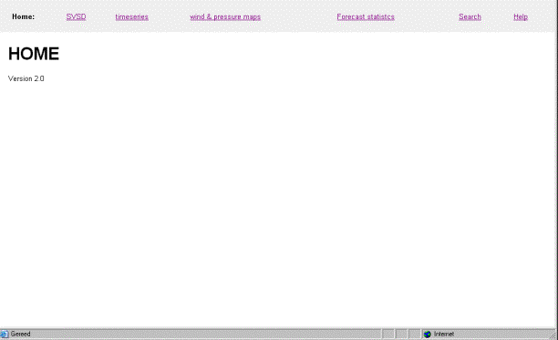
Horizontal menu items
|
SVSD |
For a number of pre-selected locations graphs are given, showing the
forecasts of data from a number of pre-selected sources, as well as the
available observed data. The period
shown comprises 72 hrs, from 0.00 hrs today onwards. The current time is
marked with a vertical line. The user controls the type of data, whether to use storm scales and the resolution of the screen. The user can also generate a table showing the most recent forecast, starting from the current time. |
|
Timeseries |
A tool that can be used to generate a graph, a table or obs2sds[1] output for data that is available in the series database which is part of MATROOS. |
|
wind and pressure maps |
A tool that can be used to generate wind and pressure maps. This is outside the MATROOS Time Series scope. |
|
Forecast statistics |
A tool that can be used to generate forecast statistics. The user selects a location, a unit, a source and a period as well as the analysis type. |
|
Search |
A search facility that can be used to list some or all available locations, units or sources together with the associated metadata. |
|
Help |
The help facility, for each page a help facility is available by clicking help on that page. |
2.2
SVSD page
Horizontal menu items
Selections made will only come into effect after the adjust button is used.
|
Home |
Return to the opening page. |
|
Unit |
Select the unit to display. In this case unit is the parameter shown. The user can choose from Waterlevel, Waterlevel surge and Wind. |
|
Graph scales |
For unit Waterlevel storm scales can be shown. Selecting these results in storm scales shown on each graph. When storm scales are used, the pre-alert, alert and alarm lines will also be shown. Please note that although Storm can be selected for other units, their scales will not change. |
|
Resolution |
The resolution can be adjusted for different sizes of screens. |
|
Adjust |
This button effectuates the selections made in the listboxes. |
|
Recent data |
This is a link to the Recent data page where an overview is given of missing and delayed data (delayed data are data that are added to the database later than expected). |
|
Help |
The help facility, for each page a help facility is available by clicking help on that page. |
|
time table |
Generate a table showing the most recent forecast for the location next to this link. A link is available for each location above the associated graph |
The surrounding area of the graph will be given the appropriate colour (see below) if one or more of the forecasts is beyond the associated pre-alert, alert or alarm level, otherwise it will be grey. It will always be grey when storm scales are used.
|
|
|
|
|
|
Alarm |
alert |
pre-alert |
normal or storm scale |
The same colours are also used in the table, here is an example (pre-alert level = 2,0 m; alert level = 2,2 m; alarm = 2,5 m):
|
All data below pre-alert line |
Some data above alarm line |
|
|
|
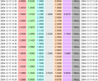
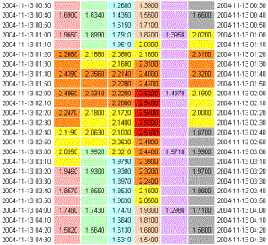
Data for different sources are easily identified by the separate background colours. These colours correspond to the line colours on the associated graph. Most colours in the table are paler to ensure that the values are still readable. Values exceeding the pre-alert line are printed on a yellow background, those exceeding the alert line on an orange background and those exceeding the alarm line on a red background (See also Section 3.1).
Only the most recent forecast is given in this table. Furthermore, there are no values given for times in the past. Thus the current time is within the ten minutes span before the first time given in the table (In this example, left table, between 12.20 and 12.30(excl.)).
2.3 timeseries page
Horizontal menu items
|
Home |
Return to the opening page. |
|
Help |
The help facility, for each page a help facility is available by clicking help on that page. |
This page is split into two: the control part (left) which offers pre-selection options and the main part where the required series can be further defined.
Control part
Selections will only come into effect after the reset
timeseries button is used.
|
Sources |
Select one or more sources from which data needs to be shown. The choices made can be edited in the main part of the screen as well. |
|
Number of series |
v If more than one source is selected, set this to Auto. v If more than one location is selected, set this to the number of locations. v For more than one source and more than one location select the total number of series required. Currently there is no mechanism in the application that calculates or checks this number. For each of the series the location and/or source will need to be checked and possibly corrected in the main part of the screen. The number of series that is to be shown can not be edited on the main part of the screen, so it is important to define this correctly. |
|
Locations |
Select one or more locations. The choices made can be edited in the main part of the screen as well. |
|
Units |
Select one unit for which data needs to be shown. The choices made can be edited in the main part of the screen as well. |
|
Output |
Select the output type required, choice of graph, table or obs2sds. If this needs to be changed, all the selections made on the main part of the screen are lost. The selection will only come into effect after the reset timeseries button is used. |
|
reset timeseries |
This button effectuates the selections made in the list boxes above. |
Main part
Selections will only come into effect after the Submit button is used.
|
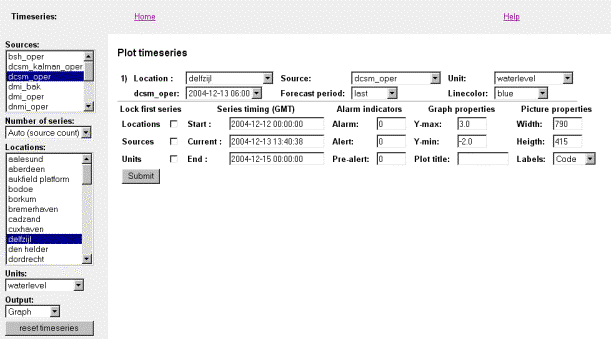
Location |
Select the location for this timeseries |
|
box below Location |
This box is preceded by the name of the selected
source. If this box is not shown it means that the associated data is not
available from that source. The required analysis time can be selected in
this box. Ensure that the name preceding this box and the name of the selected
source are the same, otherwise the wrong analysis times are displayed in the
box. If they are different click the Submit button to effectuate the
newly chosen source. |
|
Source |
Select the source for this timeseries. See also below this table.. |
|
Forecast period |
Select the forecast period for this timeseries. |
|
Unit |
Select the unit for this timeseries. |
|
Linecolor |
Select the Line colour for this time series. A paler version of this colour will also be used in the table. |
|
Lock first series |
In order to save selection time it is possible to lock the locations, sources and/or units of the remaining series to the one in the first series. This means that the locked parameter is the same for all the series. Other (unlocked) parameters remain unchanged. Check the box next to locations, sources and/or units. |
|
Series timing |
In effect the Start time and End time define the
range of the x-axis. The current time (see also below this table) can be used
to look at a forecast in the past. It defines the blue vertical line on the
plot and the graph shown is that of the most recent forecast for the current
time. |
|
Alarm indicators |
The level of the alarm indicators can be specified here. The red, orange and yellow lines are defined here. |
|
Graph properties |
The range of the y-axis can be defined here. The plot title is the title that will be displayed in the centre above the graph. |
|
Picture properties |
The width and height define the size of the screen in pixels. The labels refer to the text in the legend. There is a choice of using the database codes (codes), Dutch and English longer descriptions. |
|
Submit |
This button effectuates the selections made in the list boxes above. |
In general a graph will be shown once the Submit button is used. However, there are the following exceptions:
v Changing the source (resulting in
the name of the source being different to the name in front of the box below
Location) .The analysis time will need to be selected again from a list that is
appropriate for the new source.
v Changing the current time. The analysis time might not be within the period appropriate for the current time.
A graph might show less lines than expected (even zero), this means that there is no data available. In particular this could be true when the current time is chosen before the start time. The display period (start time to end time) could then be beyond the forecast period (usually not more than 48 or 72 hrs in advance) available at the selected current time. Other examples include a location that is not part of the forecast of a particular source.
2.4 wind- & pressure maps
![]()
Horizontal menu items
|
Home |
Return to the opening page. |
|
Help |
The help facility, for each page a help facility is available by clicking help on that page. |
There is no further explanation available for this part within the scope of MATROOS Time Series.
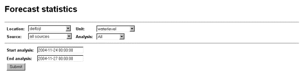
2.5 Forecast statistics
Horizontal menu items
|
Home |
Return to the opening page. |
|
Help |
The help facility, for each page a help facility is available by clicking help on that page. |
Main screen
Selections will only come into effect after the Submit button is used.
|
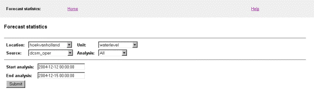
Location |
Select the location. |
|
Source |
Select the source for which the forecast data is to be compared to the observed data. |
|
Unit |
Select the unit for which the forecast statistics are to be made. |
|
Analysis |
Select the time span. Selecting e.g. 6-9 hrs, means that only the forecasts for which the reference time is between 6 and 9 hrs ahead of the analysis time are used in the statistics calculations. Selecting All means that all the available data is taken into consideration (internally this is set to 0 – 999 hrs, which is also shown on the output). |
|
Start analysis |
Select the start time of the required period. |
|
End analysis |
Select the end time of the required period. |
|
Submit |
This button effectuates the selections made in the list boxes above. |
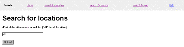
2.6 Search pages
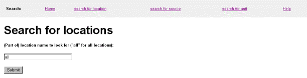
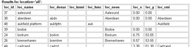
The search facility allows the user to generate a list of locations, sources or units (also showing all details available) or to find details about a certain location, source or unit. It is not a plain text search tool. First select the appropriate search facility by clicking search for location, search for source or search for unit.
Next choose one of the following options:
|
Generate a list of locations, sources or units |
Enter all as the search-string followed by clicking on the Submit button. |
|
Find more information on a specific location, source or unit |
Enter the location, source or unit name or part thereof in the search-string box an click on the Submit button. |
2.7 Logging
![]()
Horizontal menu items
|
Home |
Return to the opening page. |
|
Log |
Go to the logging page. |
|
Recent data |
Go to the page displaying the status of the recent data (default). |
|
Help |
The help facility, for each page a help facility is available by clicking help on that page. |
2.7.1 Recent data page
This page is used to check whether any data is missing from the database. By clicking on one of the underlined dates a more detailed report is generated for that entry.
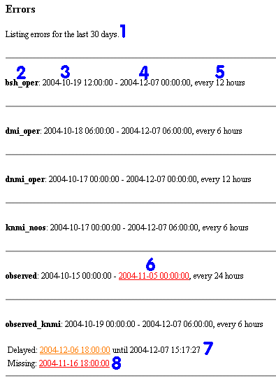
|
number |
description |
|
1 |
Number of days for which the overview is given, normally 7 |
|
2 |
Source |
|
3 |
Analysis time of earliest available data |
|
4 |
Analysis time of most recent available data |
|
5 |
Frequency of available data |
|
6 |
Date/time is marked red when there is more than 2 analysis time intervals missing (in this case individual errors are not shown) |
|
7 |
Date/time is marked delayed and orange when there is a delay in obtaining the data of more than 12 hrs |
|
8 |
Date/time is marked missing and red when there is more than 2 analysis time intervals |
2.7.2 Logging page
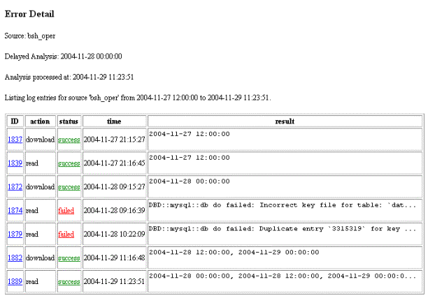
An overview of all the activities is given in the log section. This page is generally not visited by the user, but intended for the application manager.
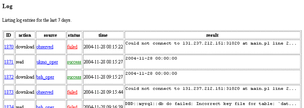
Successful actions are marked in green (success) and unsuccessful actions marked in red (failed) in the status column. A summary result is given in the table, further details can be found by clicking on one of the underlined items:
|
ID |
clicking on the ID number gives a full description of the entry. |
|
source |
clicking on a source gives a summary of entries for
that source. To return to the list with all sources click on the back arrow
of your browser. |
|
status |
clicking on the status gives the same result as clicking on the ID. |
3
User
Manual – Use Cases
This chapter contains a number of Use Cases . Each case demonstrates how to generate a graph or table displaying a certain type of data.
The opening screen gives access to
v
the
SVSD-specific part of MATROOS,
v the generic functionality (time series) of MATROOS,
v the Wind & Pressure maps (Outside the context of MATROOS time series),
v the Forecast statistics,
v
a
search facility, and
v a help page.
These options, apart from the last two, are discussed in turn in the following sections. The search facility is discussed in the previous chapter. A help page is available for each interface screen. By clicking on help a separate window is opened with information on how to use the options given on the associated interface page.
The user can return to the opening screen at any time by clicking on Home at the top left of the screen. However, this will reset the settings to default values.
3.1 SVSD
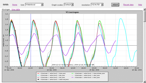
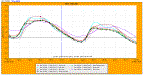
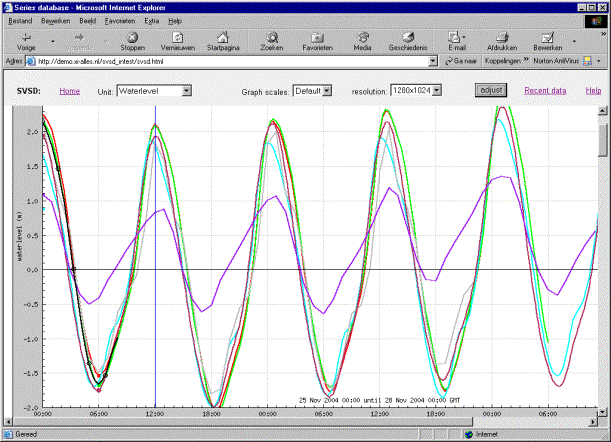
After selecting SVSD on the main MATROOS screen the SVSD interface screen is shown. For each of the pre-selected locations a graph is given, displaying the most recent available water level forecasts, as well as the available observed water level and a vertical line denoting the current time (see Section 3.1.3).
The pre-selected locations and resolution are defined in a database table, which is controlled by the application manager. The user has no access to this database.
Only one of the pre-selected locations will be shown in the following case studies, unless the case study requires otherwise. The graph for one location fills the screen, graphs for other locations can be seen by using the scroll bar on the right.
Adjusting one of the values for unit or graph scales will result in changing this item on all graphs.
3.1.1 Case 1 - Show the water level surge data
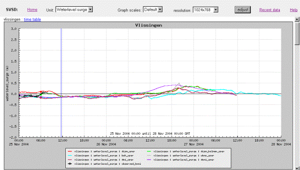
In order to generate this graph select Waterlevel surge in the Unit select box at the top and click the adjust button on the top-right. The legend of the graph shows the different sources of the forecast, as well as the fact that the black line is the actual observed data. Please note that the y-axis scale for surge is the same as that for waterlevel.
3.1.2 Case 2 - Show the wind data
By selecting Wind in the Unit select box at the top, followed by clicking the adjust button on the right a graph displaying wind data is generated. Currently there is no Wind forecast data available so no picture can be shown. For an example of a Wind data picture see Section 3.2.3.
3.1.3 Case 3 - Return to display water level data
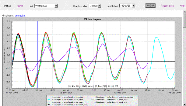
In order to return to the display of water level data select Waterlevel from the Unit select box at the top, followed by clicking the adjust button on the top-right.
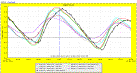
3.1.4 Case 4 - Display storm scales
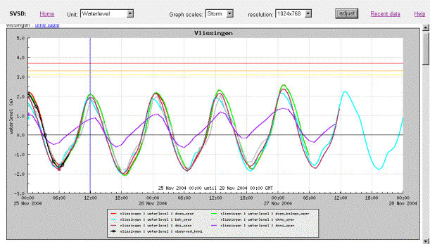
Storm scales can only be used whilst displaying water level data. The y-axis (water level) changes to a broader range (pre-defined in a database table controlled by the application manager) and three additional lines are shown:
v
yellow
line (lowest line): pre-alert.
v orange line (middle line): alert.
v red line (top line): alarm.
Select Storm from the Graph scales listbox in the middle at the top, followed by clicking the adjust button on the top-right.
3.1.5 Case 5 - Use different resolution
By selecting a larger resolution in the resolution listbox at the top, followed by clicking the adjust button on the top-right the display is enlarged.
3.1.6 Case 6 - Display the data associated with a graph
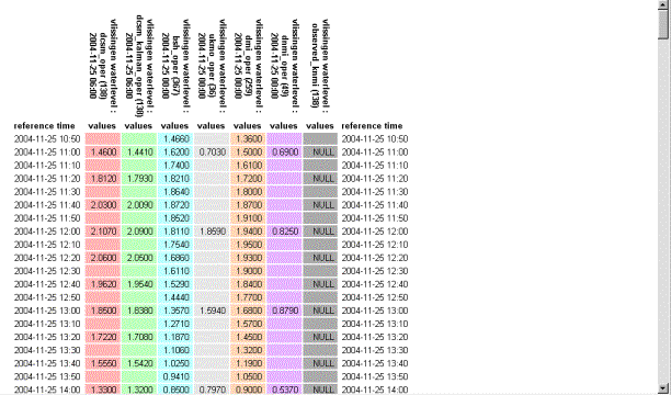
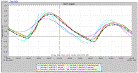
The table given above is displayed in a separate window and can be generated by clicking on time table next to the location (in this example Vlissingen) for which the data is to be displayed (see arrow):

It can be seen from the above example that forecast data might not be available at the same time intervals. The table, however, is set up such that the available data can be easily compared.
3.2 Timeseries
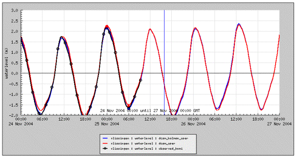
3.2.1 Case 7 - Show the hindcast/forecast of water level and compare with observed data for a date in the past.
In this case the hindcast/forecast of water level at Vlissingen on November 12th 2004 at 2pm has been created, and compared with the observed water levels. As maximum forecasted water levels were high, the storm scale has been used, and the alert/alarm indicators are shown[2].
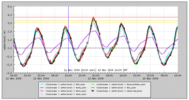
This can be done as follows:
1.
Select
the sources on the left: bsh-oper, dcsm_kalman_oper, dcsm_oper, dmi_oper,
dnmi_oper, observed_knmi and ukmo_oper.
2. Select number of series: Auto.
3. Select the location: Vlissingen.
4. Select the unit: Waterlevel.
5. Select output type: Graph.
6. Click on reset timeseries.
An overview of pre-selected and default settings will be generated on the main screen as follows:
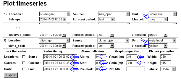
Changing the values indicated by blue arrows to the ones given below, followed by clicking on the Submit button will generate the graph displayed above.
3.2.2 Case 8 - View water level along the coast
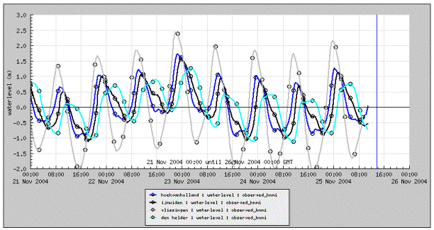
To obtain the above figure the following steps were taken:
1.
Select
the source on the left: observed_knmi.
2. Select number of series: 5.
3.
Select the
locations: hoekvanholland, ijmuiden, noordwijk meetpost, vlissingen and den
helder.
4. Select the unit: waterlevel.
5. Select output type: Graph.
6. Click on reset timeseries.
In order to know whether data is available from a certain source for a certain location, the search facility can be used, see Section 3.5.
In the settings on the main screen set the Series timing (Start, Current and End) to the values given above. Next click the Submit button and the graph will be displayed. It shows that all series are observed data by using symbols.
3.2.3 Case 9 - Show wind forecast
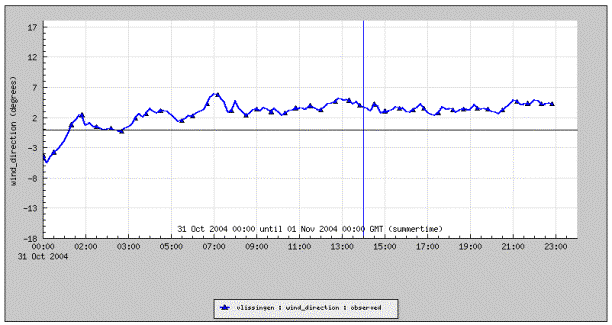
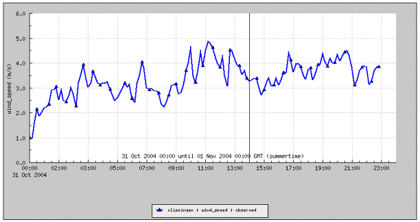
To obtain the above figure the following steps were taken:
1.
Select
the source on the left: observed.
2. Select number of series: Auto.
3. Select the locations: Vlissingen.
4. Select the unit: winddirection.
5. Select output type: Graph.
6. Click on reset timeseries.
In the settings on the main screen set the Series timing (Start, Current and End) to the values given above. Next click the Submit button and the graph will be displayed.
In order to generate the windspeed graph next, only make changes on the main part of the screen. In the settings there is a list box Units on the right. Change this from winddirection to windspeed and adjust the Graph properties Y-max to 6.0 m/s and Y-min to 0.0 m/s. Next click the Submit button and the graph will be displayed.
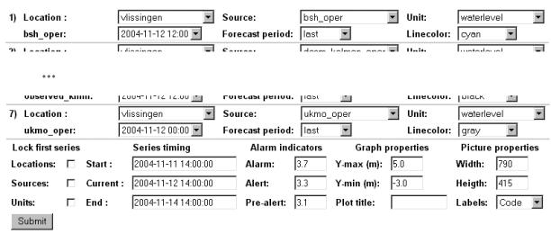
3.2.4 Case 10 - Produce a number of graphs with similar specifications
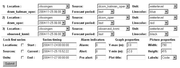
To obtain the above figure the following steps were taken:
1.
Select
three sources on the left: dcsm_kalman_oper, dcsm_oper and observed_knmi.
2. Select number of series: Auto.
3. Select the locations: Vlissingen.
4. Select the unit: Waterlevel.
5. Select output type: Graph.
6. Click on reset timeseries.
Change the line colours to the ones agreed on: black for observed and red for dcsm_oper. Click on the Submit button to generate the graph.
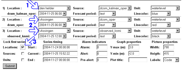
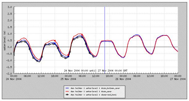
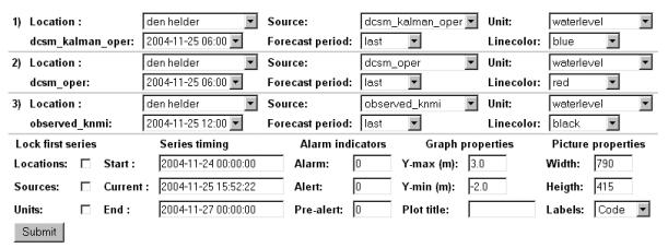
Next the graph for Den Helder is going to be produced. All other settings have to remain the same. Therefore change the location in series 1 (arrow 1) to den helder. Leave locations in 2 and 3 as they are (arrows 2). Check the box after Locations in Lock first series (arrow 3). Click on the Submit button to generate the graph that is displayed below. In the series descriptions list it can be seen that all 3 locations are now den helder, and all the other information remains unchanged.
A similar procedure can be followed when all the sources need to be the same as the first source, and when all the units need to be the same as the first unit.
The procedure holds for any number of series.
3.3 Wind and Pressure maps
This area of MATROOS is not part of MATROOS Time Series. Therefore it is not described in this document.
3.4 Forecast statistics
The forecast statistics interface screen is as follows:
For the above chosen parameters the forecasts statistics are generated by clicking the Submit button which results in:
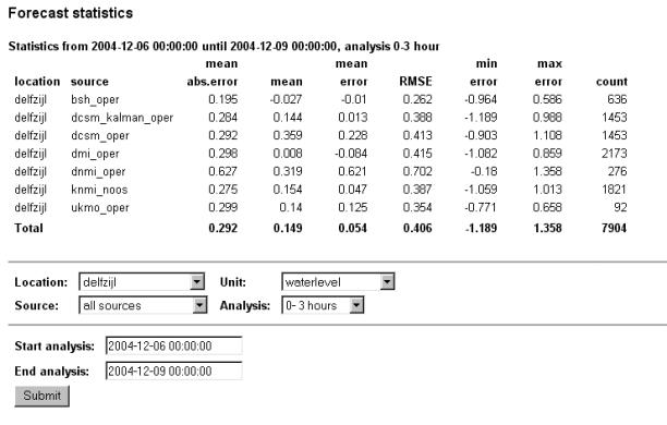
The following statistics are calculated by comparing the chosen dataset to the observed data:
|
mean absolute error |
the
mean value of the positive and negative errors, ignoring negative
signs |
|
Mean |
arithmetic mean[3] |
|
mean error |
the mean value of the positive and negative errors, taking the sign into consideration |
|
RMSE |
root mean square error[4] |
|
minimum error |
smallest individual error |
|
maximum error |
largest individual error |
|
Count |
number of records |
3.5 Search
The search facility allows the user to generate a list of locations, sources or units or to find details about a certain location, source or unit.
3.5.1 Case 11 - Generate a list of locations, sources or units
First select the appropriate search facility by clicking search for location, search for source or search for unit. Next enter all as the search-string followed by clicking on the Submit button. In the figures below an example is given for each of the search facilities.
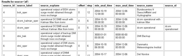
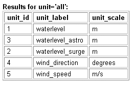
3.5.2 Case 12 - Find more information on a location, source or unit
Enter the location, source or unit name or part thereof in the search-string box an click on the Submit button. The available information will then be displayed in a table with the same headers as given in the examples in Section 3.5.1. The item entered in the search-string box is directly transferred to a MySQL query, thus MySQL wildcards can also be used.
3.6 Logging tool
3.6.1 Case 13 – Check whether all the expected data is actually in the database
Go to the logtool by clicking Logging on the home page. The Recent data page will then be displayed. If not, click on Recent data. The following will be shown:
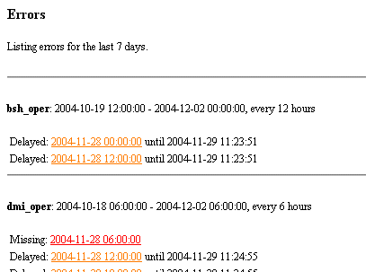
A general description of this page is given in Section 2.7.1. By clicking on one of the underlined dates a more detailed report is generated for that entry, generally this is of interest only to the application manager. A red entry shows that data from that analysis time is missing for more than 2 analysis time intervals, an orange entry is a warning that obtaining the analysis was delayed by more than 12 hrs. This has implications for the post-event analysis of e.g. a storm. If situations are to be recreated, allowance has to be made for the missing data at that moment, i.e. if obtaining the data was delayed, it should not be used for the recreated situation even though it might now be available. However, information on when data was obtained is not stored in the database, so currently it is not possible to recreate a graph from the past.
3.6.2 Case 14 – Investigate missing items in a database further
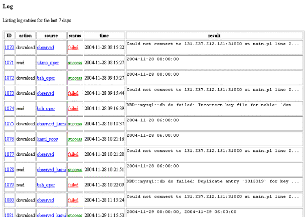
An overview of all the activities is given in the log section. Successful actions are marked in green (success) and unsuccessful actions marked in red (failed) in the status column. Further details can be found by clicking on one of the underlined items:
|
ID |
clicking on the ID number gives a full description of the entry |
|
Source |
clicking on a source gives a summary of entries for that source. To return to the list with all sources click on the back arrow of your browser. |
|
Status |
clicking on the status gives the same result as clicking on the ID |
An example of a full description of an entry is given below: